From my holiday location at the coast of Bulgaria I finished up the implementation of the UI of Thuis. It works nicely on both the iPhones and the iPad on the wall. This blog will give you a demo and bring you up-to-date with some of the changes I made since the last post.
Adding the Slider Tile
I already implemented the UICollectionViewController and several tiles in the last blog post, however it was lacking the SliderTile implementation. For this several changes were needed, for example a tile should be able to span multiple columns to create enough space for the slider. For this a new property is added to Tile called columns. It now looks like this:
class Tile {
    let title: String
    var icon: UIImage?
    var value: String?

    let columns: Int

    let topics: [TopicType: String]

    init(title: String, icon: UIImage, columns: Int, topics: [TopicType: String]) { ... }
    convenience init(title: String, icon: ionicon, columns: Int, topics: [TopicType: String]) { ... }
}
UICollectionViewController can handle cells of different sizes, so making sure they display correctly is luckily easy:
extension TilesCollectionViewController: UICollectionViewDelegateFlowLayout {
	func collectionView(_ collectionView: UICollectionView, layout collectionViewLayout: UICollectionViewLayout, sizeForItemAt indexPath: IndexPath) -> CGSize {
		let tile = tiles[indexPath.row]
		let height = self.view.bounds.height / 6.0

		switch (tile.columns) {
			case 1:
				return CGSize(width: self.view.bounds.width/2.0 - 12.0, height: height);
			case 2:
				return CGSize(width: self.view.bounds.width - 16.0, height: height);
			default:
				print("Not supported amount of columns for button");
				return CGSize.zero
		}
	}
}
Now we can actually implement the SliderTile itself. First we add the slider to the UI:
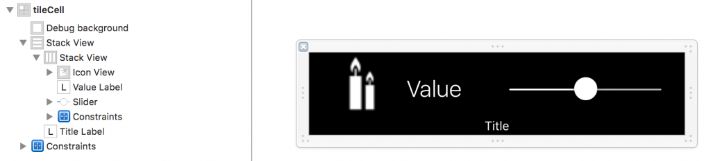
The TileCollectionViewCell class got some more functionality now. To make things easier I moved some of the logic from the TilesCollectionViewController to here. It now takes care of deciding what to show and what to hide. For example the value will be hidden when there is no value (for buttons) or when a slider is used (the slider already visualizes the value).
To handle changes of the value when someone uses the slider a delegate method had to be added. The slider is linked to the delegate method in the TileCollectionViewCell, but this delegates the actual work to the SliderTile. This class also has some properties defining the slider, such as the minimum and maximum allowed values, and takes care of updating the slider when a MQTT message arrives.
class SliderTile: Tile, TileCollectionViewCellDelegate, MQTTSubscriber {
    let minimumValue: Float
    let maximumValue: Float
    let rounded: Bool

    var publishDelayTimer: Timer?

    init(title: String, icon: UIImage?, columns: Int, topic: String, minimumValue: Float, maximumValue: Float, rounded: Bool) {
        var topics = [TopicType: String]()
        topics[.status] = topic
        topics[.set] = "\(topic)/set"

        self.minimumValue = minimumValue
        self.maximumValue = maximumValue
        self.rounded = rounded

        super.init(title: title, icon: icon, columns: columns, topics: topics)
    }

	convenience init(title: String, icon: ionicon, columns: Int, topic: String, minimumValue: Float, maximumValue: Float, rounded: Bool) {
		self.init(title: title, icon: nil, columns: columns, topic: topic, minimumValue: minimumValue, maximumValue: maximumValue, rounded: rounded)
		self.icon = icon
	}

    func didReceiveMessage(_ message: MQTTMessage) {
        if topics.values.contains(message.topic) {
            guard let payloadString = message.payloadString else {
                print("Received empty message for topic '\(message.topic)'")
                return
            }

            if rounded {
                if let _ = Int(payloadString) {
                    self.value = payloadString
                } else {
                    print("Received invalid message for topic '\(message.topic)': \(payloadString)")
                }
            } else {
                self.value = payloadString
            }
        }
    }

    func sliderValueDidChange(_ sender: UISlider!) {
        if rounded {
            value = "\(Int(sender.value))"
        } else {
            value = "\(sender.value)"
        }

        if let topic = topics[.set],
           let payloadString = value {

            // Invalidate any previous requests
            if let timer = publishDelayTimer {
                timer.invalidate()
            }

            publishDelayTimer = Timer.scheduledTimer(withTimeInterval: 0.1, repeats: false) { _ in
                MQTT.sharedInstance.publish(payloadString, topic: topic, retain: false)
            }
        }
    }
}
Adding a optional postfix to values
Some of the InfoTiles show the weather, and for the temperature it’s a lot clearer when we include a degree sign next to the value. So I’ve added an optional postfix to the value of a Tile. This is a simple String property which is added at the end of the value before display:
valueLabel.text = tile?.value

if let value = tile?.value, let valuePostfix = tile?.valuePostfix {
	valueLabel.text = value + valuePostfix
}
Changes to support iPad
The iPhone and iPad have a very different screen size and of course we don’t want to duplicate any code, or add checks everywhere. Luckily for us Apple solved most of this by providing adaptive layouts and layout constraints. We’ll use the latter to slightly change the layout of the TileCollectionViewCell to adapt to the bigger screen. Apple differentiates between devices by using so-called size classes, which are very well described in The Adaptive Model. There are two changes we have to make: change the icon size and the width of the slider. The icon will be 45 points on compact-width devices and 70 on regular-width devices. The slider will get a width of 200 points on compact-width devices and 400 on regular-width devices.
Determining the size of the cell was already working well on all devices as it’s using a size based on the size of the superview. You can see the implementation of the slider above.
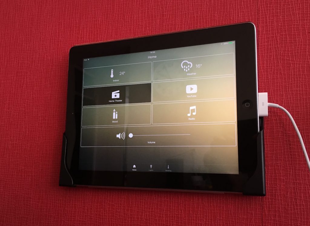
Demo
The implementation of the design Marina made for the Thuis app is now implemented, and how better to show it then with a demo:
In the demo you can see the different screens on both an iPad and an iPhone. At the bottom you can see the MQTT messages being send and received. Notice that when clicking a button a message is send to the set-topic (for example Thuis/device/living/moodTop/set) by the iOS app. Then a message is received on the status topic for that device (Thuis/device/living/moodTop), which is sent by Zway.
When a scene is triggered (in this case Mood, which are the mood lights in the living room) you see the Core sends a message for each device in that scene. The status is also reflected on the iPhone. The slider for the main light in the dining sends out messages every time when you pause for a tenth of a second.
This should give you a good overview of the app and its design. Off to the next use case!
Pingback:Home Theater part 2: controls - Thuis Home Automation